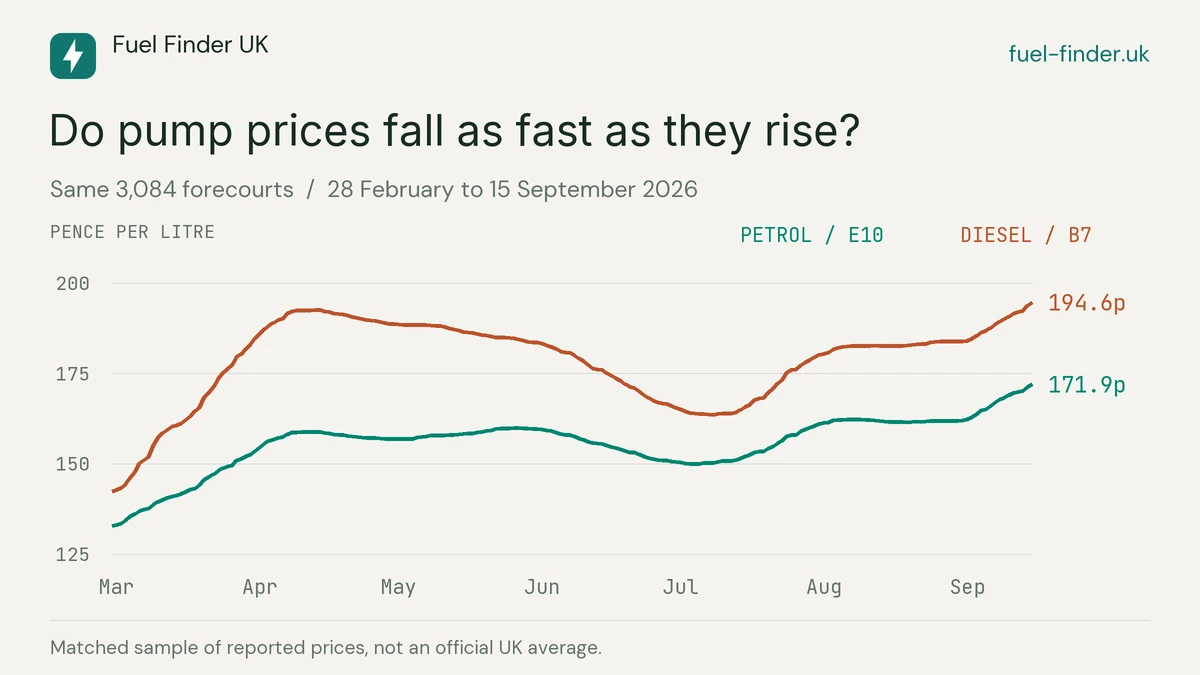
Do prices at the pump come down as readily as they go up? That was the question I wanted to look at with these videos. A single day's price, or a headline about oil, cannot show how long a rise or a fall has taken.
I followed the same 3,084 forecourts from 28 February to 15 September 2026, covering 200 calendar days across 12 UK regions. There is a clear rise, fall and renewed rise in the figures. The first climb was steeper than the retreat that followed, particularly for diesel. The videos also show why oil on its own cannot explain every change at the pump.
Fuel Finder lists more forecourts than this. For these videos, I used a fixed sample from the major-retailer histories, keeping stations with both fuels and sufficiently complete records for the whole period. Stations with shorter histories, records for only one fuel, or longer gaps were left out. Keeping the same stations throughout means a changing mix of forecourts cannot create the movement on its own. The figures are averages within that sample, rather than official averages for every station in the country.
Watch the regional prices change
The map shows petrol and diesel side by side. Both use the same fixed colour scale, from 120p to 200p a litre, so a darker shade means a higher price throughout the video. The date moves forward chronologically, with Brent and the pound below the maps.
The first rise was sharper than the retreat
To compare the broad phases without choosing different dates for each fuel, I split the period at Brent's high on 7 April and its subsequent low on 2 July. The table shows the change in the sample's average pump price between those dates.
| Period | Elapsed days | Petrol | Diesel |
|---|---|---|---|
| 28 February to 7 April | 38 | +25.3p | +49.2p |
| 7 April to 2 July | 86 | −8.0p | −27.0p |
| 2 July to 15 September | 75 | +21.7p | +30.1p |
Both fuels rose more quickly in the first period than they fell in the second, across all 12 regional samples. That tells us what happened here, rather than how prices will always behave. The middle stretch was not a continuous fall: petrol, in particular, rose again before coming down.
Brent itself also climbed faster than it fell: from $71.32 to $138.21 in 38 days, then down to $68.53 over the next 86. The crude benchmark was therefore following an uneven path too. A fair comparison of response times needs to account for that.
Where prices looked sticky
Diesel gives the clearest example. Its sample average rose from 142.4p to 192.6p between 28 February and 14 April: 50.2p added in 45 days. It then took 85 days to fall to 163.6p on 8 July, giving back 29.0p. By 15 September it had risen to 194.6p, above that spring peak.
Petrol's route was less tidy. It had an initial spring peak on 13 April, then a slightly higher one on 27 May. There was not one steady climb followed by one steady fall, and measuring from April or May gives quite different answers about speed.
I also compared each forecourt's recorded closing price with the previous day's. For petrol, 85.0% of those comparisons were unchanged during the April-to-July window, against 64.5% during the initial rise. Recorded prices changed less often during the retreat. Because the history carries the last recorded price forward between updates, this is a measure of the stored daily series, not confirmation that every forecourt's price was checked and held unchanged each day.
Oil and pump prices are different measures
On 2 July, Brent was below its opening level: $68.53 a barrel, compared with $71.32 at the start. Petrol in the sample was still 150.2p a litre and diesel 164.5p, respectively 17.3p and 22.1p above their opening prices.
There are several stages between those two prices. Brent is crude oil. Forecourts buy refined petrol and diesel, whose wholesale prices can move differently. Refining, distribution, tax, operating costs and retail pricing all sit between the crude benchmark and what we pay. Stock purchased at earlier prices also affects the timing. The Competition and Markets Authority's road fuel review explains those stages.
To work out how quickly changing costs reach the pump, I would need wholesale petrol and diesel prices alongside these figures, a longer history, and a way to allow for tax changes and the size of each movement. For now, the useful finding is that the rise and the fall took different paths. The videos make those movements easier to follow.
What the pound adds to the picture
The second video makes individual regional prices easier to read. Below them are separate charts for Brent in dollars and the number of dollars bought by £1. They share the same dates, but have different units and scales, so the height of a movement in one should not be compared directly with the other.
A stronger pound buys more dollars, reducing the sterling cost of a barrel at the same dollar price. The conversion is simply Brent in dollars divided by the dollars bought by £1.
In this period the pound moved along the way but finished almost where it began: £1 bought $1.3471 at the start and $1.3483 at the end, a rise of just 0.09%. Brent increased by 83.4% in dollars and 83.2% in pounds, from £52.94 to £97.01 a barrel. Currency made very little difference when comparing the beginning and end of these 200 days, even though it matters to the conversion on any given day.
The regional gap still matters
By the final date, sample petrol prices ranged from 165.2p in Northern Ireland to 173.6p in the South East. Diesel ranged from 187.8p to 196.2p in the same regions. That is about an 8.4p-a-litre gap for each fuel, equivalent to roughly £4.20 on 50 litres.
Those are differences between regional sample averages, not a saving available to every driver. Northern Ireland contributes 63 forecourts here and the South East 478; their retailer mix and coverage differ. A regional average also hides the differences between nearby stations.
For a decision about where to fill up, I would still compare the current prices near my route. The history helps explain what has happened. It cannot promise when the next reduction will reach a particular forecourt.
How I built the comparison
- One consistent sample. The same 3,084 currently active major-retailer forecourts contribute both petrol (E10) and diesel (B7) throughout. Each station has equal weight. These are not sales-weighted or official UK and regional averages.
- Daily recorded prices. Each day's value uses the last recorded price at the close of that calendar day in UK time. The starting observations are no more than 21 calendar days old; sites are retained only if neither fuel's record becomes more than 30 elapsed days old during the period. This favours histories with more frequent recorded changes and does not establish a fresh observation every day.
- Selection matters. The sample uses retained major-retailer history and current station activity and locations. It excludes many forecourts, including sites without sufficiently complete histories, so it should not be treated as a complete account of the market.
- Comparable market dates. Brent uses EIA's Europe spot series through FRED. The pound-dollar rate is calculated from the ECB's same-date euro reference rates. Non-publication days carry the latest earlier observation forward; the opening market values are from 27 February. These are indicative benchmarks, not simultaneous trading quotes or actual hedged purchasing costs.
- Motion and rounding. Smooth transitions interpolate between daily values, rather than adding observations. Changes are calculated before rounding. The figures cover this historical period and are not today's live pump prices.
Sources: Fuel Finder's retained station price history, extracted on 17 September 2026; EIA Brent prices via FRED; ECB reference exchange rates; ONS International Territorial Level 1 boundaries. The maps contain Ordnance Survey and ONS intellectual property rights.