Producing a local fuel-price chart
Define the area, check the reporting date and station coverage, then prepare the chart and source notes for your article.
Define the area before writing the headline
Publisher Studio currently offers the UK aggregate and six postcode areas: BS (Bristol), YO (York), LS (Leeds), M (Manchester), B (Birmingham) and SW (South West London). These are postcode-prefix selections, not city or council boundaries.
Describe the selected area precisely. “Petrol prices across the BS postcode area” sets a clearer scope than “Bristol petrol prices” when the underlying selection extends beyond the city. If your story needs a different area or a custom boundary, the current self-service selection does not answer that question.
Keep petrol (E10) and diesel (B7) separate. Their price levels and changes describe different fuels, so a combined headline should explain both rather than imply a single average pump price.
Choose a layout that matches the question
- Price trend
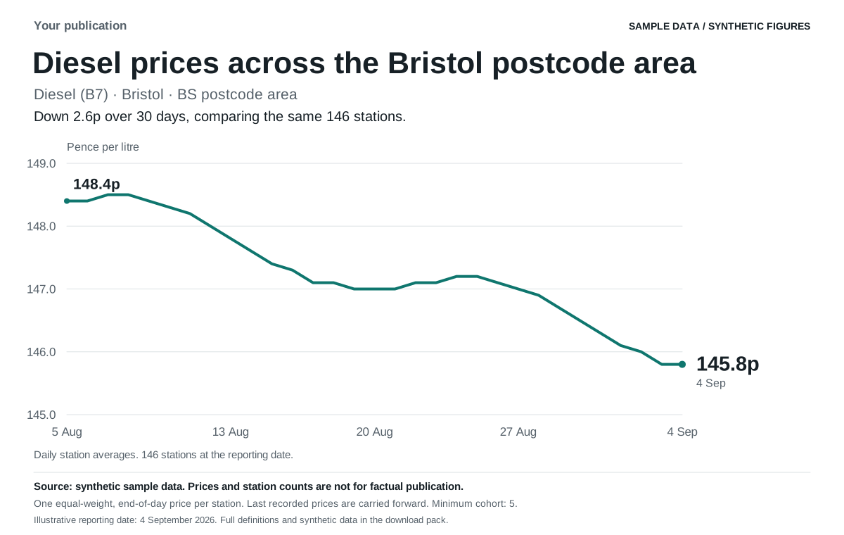
- Use a 7-day or 30-day view to show reported price changes through the selected period.
- Brand comparison
- Compare forecourt canopy brands in the selected area at the reporting date. These labels describe the brand on the forecourt, not the legal owner. The period control concerns the change calculation, not an average of all brand prices over that period.
- Price snapshot
- Show a current average with supporting context. Any illustrative filling cost should retain the stated tank size and should not be presented as a quote from a particular station.
Check which stations contribute to the figures
Studio gives each station one equally weighted end-of-day price. It does not give extra weight to a station because it reported several price events. The last recorded price is carried forward until another event, so the station count is not a count of newly reported prices that day.
An average requires at least five stations. Gaps indicate insufficient coverage and should stay visible. Do not fill them with invented values or describe a missing period as flat prices.
The change figure compares stations present at both endpoints. This matched cohort can differ from the stations included in each displayed daily average. As a result, the published change may differ from subtracting the two daily-average labels. Use the supplied change and its explanation together.
A reporting cohort is not a census of every forecourt, and an average does not identify the cheapest station. Review the Data and Source notes views before turning a chart into a claim about the whole area.
Distinguish the reporting date from the latest source event
The reporting date tells readers which period the chart describes. Dataset generation time indicates when the published dataset was prepared. A latest source timestamp identifies the most recent recorded price event; it does not mean every contributing station was freshly observed then.
Check freshness notices in the editor. If a local dataset is unavailable, the editor can show an explicit sample for layout work. Sample prices, comparisons and station counts are synthetic and must not appear in factual reporting.
Include the selected area, fuel, reporting date and source in the caption or article. For example, describe a figure as the reported petrol average for the BS postcode area on the dataset’s date, rather than calling it the price every driver will pay today.
Prepare the chart for its destination
Set the publication name, colour, logo and font in Branding, then inspect the actual export preview. A light brand colour may be adjusted so the chart remains readable on white. Logo size, position and background can be changed without cropping the artwork into an unreadable mark.
A PNG is a fixed image for an article, newsletter or social post. SVG provides a scalable graphic. CSV lets an editor inspect the figures in a spreadsheet, and the complete ZIP pack keeps both chart formats, data and methodology together.
Use a saved embed when the page should follow later published datasets. Use a fixed export when the article needs to preserve the figures it discusses. The website widget guide explains installation, attribution and saved-setting behaviour.
Keep a repeatable editorial check
For each edition, reopen the saved publication, confirm the area and fuel, review the new reporting date and station coverage, then read the change against the source notes. Export a dated pack after that review. Reusing a template should not mean reusing last week’s conclusion.
Automated weekly email delivery is not available yet. Download a fresh pack from the editor when preparing the next edition.
For wider background, read the Fuel Price Pulse methodology. For bespoke boundaries or a supported data product, review the managed publisher services.
Review a local chart in Studio
Try supported areas and layouts with synthetic data. The planned £99/month Publisher plan is not open for paid subscriptions yet.